
Import | Visualise | Publish
It’s as easy as that and the reason Power BI usage has exploded: putting the power of data in the hands of users.
Take time, go the extra mile and enrich your model. Become the Power BI superhero who delivers fantastic content users find a pleasure to navigate. Ensure Power BI adoption is high and your project is successful.
Here are 13 easy steps you can implement today.

1. Remove
Do not import all columns from source simply because you can. Ingesting columns not required will slow down processing, impact performance and increase your in-memory footprint. Bloated data models might violate your Power BI Pro limits or necessitate additional Premium capacity, unnecessary additional costs for your business.
If importing from an OLTP database, import data from views, not tables. Views provide a layer of abstraction, giving security benefits in addition to only exposing the columns required for BI. Alternatively, remove unnecessary columns in the Power Query Editor (PBI Desktop | Home ribbon | Edit Queries | Right-click column header | Remove column or Remove Other Columns).
2. Rename
We know you’re a conscientious database developer and you logically separate your database objects into schemas. Your end-users are less interested and don’t need this information in their BI solution. By default, Power BI adds the schema name prefix to the table:

As a BI developer, you will also encounter a mixed bag of object naming conventions. Do you report from cryptic columns or mixed-domain columns with names including the data or object type? That discussion is a whole other post, but examples are emp5, strTeam or colYear.
Rename all your data model tables and columns. The ability to abstract the reporting name from the underlying source name is a property of a semantic layer, and it’s as easy as “click ellipses | Rename” in Power BI. Choose simple, unambiguous nouns understood throughout your business. Remove extraneous information. Create consistency in case, spacing and pluralisation.
3. Relate
In general, your data model will consist of many tables that you must relate together. Newcomers to Power BI will be familiar with a scenario like:
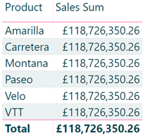
The sales and product tables are not related, so Power BI cannot proportion sales across products and incorrectly returns the same number for each.
Create your model using a star schema design. Place text labels in dimension tables and numeric measures in a central fact. Relate the dimension to the fact using non-null integer columns. The relationship should be one-to-many (1:*) and have a single cross filter direction.
Well, maybe not always? You might:
- Only have one table.
- Relate non-integer columns.
- Create relationships with many-to-many cardinality (*:*).
- Create bi-directional relationships.
Ensure you fully understand the implications on your DAX measures and performance when including these more advanced techniques. If you’re unsure, stick to the generic advice above.
Click the model icon in Power BI desktop and relate your tables.
4. Be Explicit
I have written before about creating explicit DAX measures in your data model in my blog Get DRY with Power BI. Your benefits are:
- You define the name, formatting and logic of the measure once.
- Consume measures in other measures leading to code re-use and ease of maintenance.
- Explicit measures work with the Analyse in Excel feature, and implicit measures do not.
- You use the full functionality of DAX rather than basic mathematical grouping operations.
Create explicit DAX measures rather than relying on Power BI to create implicit measures.
5. Hide
Following from the previous two points, hide all columns that won’t enhance your end user’s reports. Examples of such columns are:
- Surrogate key columns from your data warehouse - if you relate tables using meaningless integer surrogate keys from your data warehouse, hide these from the end-user. The only purpose of such columns is the relationship and they usually have little value within reports.
- Fact table measure columns - if you create explicit DAX measures, hide the underlying fact table columns. For example, you might have a “Units Sold” column. Create a measure “Sum of Units Sold := SUM(‘Sales’[Units Sold]) and hide the “Units Sold” column so report users are not confused.
Fact tables usually only consist of dimension keys to relate tables and numeric measure columns. We stated above to hide both these columns types, resulting in no fact table columns being visible in your data model, only measures. A great side-effect of this is the fact table floats to the top of your data model and its icon changes to a calculator symbol. This Power BI behaviour enhances the end-user experience and differentiates the table types and signposts where the user should navigate to for their measures.
6. Summarise
All numbers are not made equal. Some you wish to sum, count and average and others you do not. Examples of the latter are Month in Year or Invoice Line. Summing invoice lines 1-7 and reporting 28 is nonsense.
Power BI doesn’t know which of your numeric columns fit into each category. This inference would be a great use case for machine learning, so maybe someday?
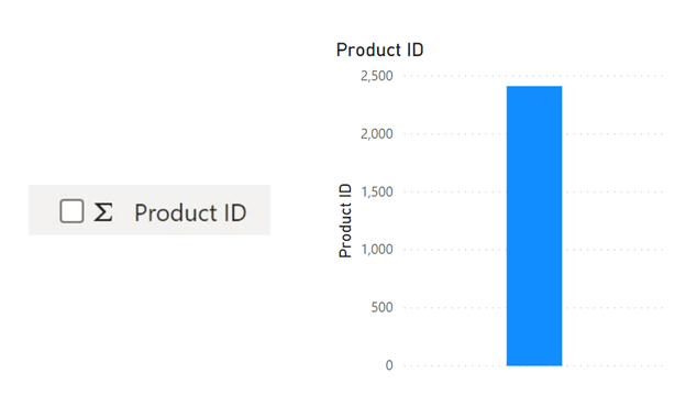
Power BI applies a default mathematical grouping operator to numeric columns and denotes them with an uppercase sigma (Σ) in the data model. The annoyance for report creators is such columns are measures by default when dropped onto the reporting canvas and not dimensions to slice and dice by as intended. See this screenshot with a Product ID as an example:
Review your data model. Ensure a mathematical grouping operator is appropriate for all columns prefixed with a sigma. If not, change the “Default Summarization” from the modelling toolbar (Power BI desktop) to “Don’t summarise”.
7. Format
Format every attribute in your data model consistently. Ask questions such as:
- What date format is the company standard?
- Do end-users need to see currency decimals? If summing gross sales, pence or cents adds little value and clutters the screen.
- Does your accounting department prefer 1 decimal place for percentages?
- Is a measure an integer or decimal? How many decimal places are appropriate?
If no company standard exists, create one. Format financials, percentages and dates consistently throughout your reports. It is confusing for end-users to deal with a mixture of formatting and hinders usability.
Conditional formatting is another opportunity to apply consistency. A typical Power BI technique is to apply traffic light (RAG) colour coding to indicate areas of concern in your business. Use precisely the same shades of colour to show good and bad so users can navigate and drill though to get immediate graphical feedback without having to decipher different colour meaning in various charts.
8. Separate Thousands
Don’t make your users have to lean into their screen, straining their eyes to read 973759137573. Click the thousands separator button on the modelling toolbar to provide a far more readable measure: 973,759,137,573.
9. Categorise
Power BI provides many geolocation, URL and Barcode categories you should assign to columns. For example, denote the country column as such by selecting the Country/Region category from the modelling toolbar. This simple action gives your users context by pre-fixing the column with a globe icon and creating a map visual by default when you drop the column onto the reporting canvas.

10. Describe
Hopefully, your naming standards from above make each attribute unambiguous for your users. That will not always be the case as you expose company departments to a data model containing unfamiliar terms.
On the model tab, populate the description box for each column in your model with relevant information to explain to users what each means. Now when the user hovers over that column in the reporting canvas, they see a tooltip explaining the context and purpose of each column. Adding descriptions creates a self-documenting solution and dramatically enhances the usability of your reports.
11. Create Hierarchies
Your business will naturally generate hierarchies in its data, maybe:
- Product Category | Sub-Category | Product
- Year | Quarter | Month | Day
Create the appropriate hierarchies in your data model to allow your users to drill up and down datasets with ease.
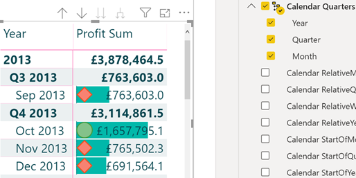
In the example below:
- Create your Calendar Quarters hierarchy by dragging Quarter and dropping on Year. Repeat for Month and give your hierarchy a name.
- Drag the hierarchy onto the reporting canvas, change to a matrix visualisation type, drop a measure onto the visual.
- Specific visuals (matrix being an example) support drilling up and down via the arrow buttons you can see below:
12. Sort
By default, Power BI orders text alphabetically. Don’t make your users look at:
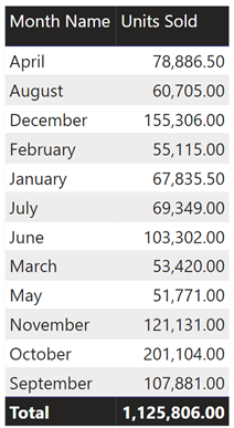
Select the [Month Name] column, then click the “Sort by Column” on the modelling toolbar. Sort [Month Name] by [Month Number] to order months correctly and chronologically. A pre-requisite is a [Month Number] column in your model.
Another use case could be ordering the most populous countries first.
13. Display in Folders
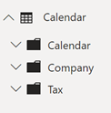
Some of your tables contain many columns. An example is your calendar table that typically contains many columns for the calendar year, company fiscal year and taxation year. This approach provides a rich reporting experience for your users, allowing carving up of data by dates of their choosing.
A downside of many columns is the table is cumbersome to navigate. The attribute of interest might be off the screen, requiring them to scroll through many columns.
Create sub-folders under your tables to logically group columns. Place columns into folders via the Model tab. A great feature of the enhanced modelling experience is the ability to multi-select many columns and place into a folder in one operation. Below you see the enhanced Calendar table with three sub-folders:
Close
- Are end-users praising your Power BI solution?
- Is usage in your business high?
- Is Power BI introducing a data-driven culture using analytics to grow your company?
- Are users enthused and requesting more Power BI content?
The opposite is you deploy cumbersome, poorly-performing reports that are difficult to navigate. Adoption is low, and your Power BI project has not deemed a success.
Implement these 13 steps today to turbo-charge your Power BI.
