
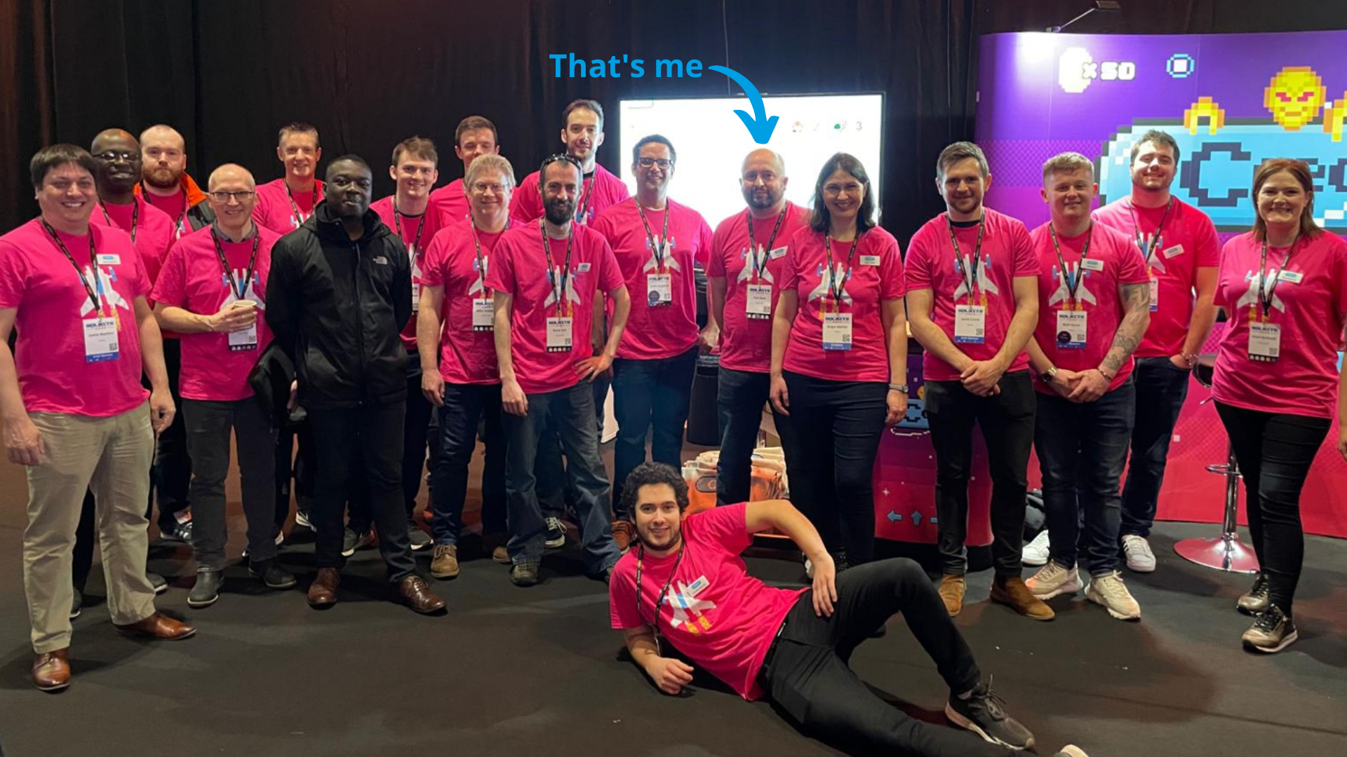
The Coeo team was excited to see everyone who attended SQLBits this year! For those who missed out, I’ll fill you in. We turned up in quite a number and full colour. See if you can spot me in the photo below.
And that big screen behind me is why I am writing this blog. I was tasked with creating a game and running a competition where attendees could win a prize. The initial brief was to find an arcade game we could collect data from and display the game results in Power BI. I wanted to use a character that I felt people would instantly recognise, so I spent an afternoon conducting extensive “research” into Pac-Man and Sonic the Hedgehog. Eventually, I settled on Super Mario and began to build it out from there.
Each player’s progress and results from the game were displayed in real-time on a leaderboard, running off an instance of Power BI. As a team, we are used to building bespoke solutions like this. Using our years of experience, we create cutting-edge solutions for our customers, whether in the retail, finance, or professional services industries. As well as being fun, this brought together two themes from this year’s SQLBits: retro gaming and the Microsoft Data Platform.
Researching Arcade Games
The game was created using Azure services and Power BI to collect and analyse gameplay in real-time, displaying the results in Power BI. I conducted extensive “research” into arcade games, spending an afternoon or two playing researching Pac-Man, Mario Kart and Sonic the Hedgehog. The recurring obstacle I faced was how to collect data from the emulators used to play these games.
Eventually, I found a python version of Super Mario Bros on GitHub. Having access to the source code meant editing the game and collecting gameplay data would be possible.
Building the Data Solution
Having decided on Super Mario, I needed to make the game’s data available in Power BI. This data would be presented as many small, fast-paced messages, and I decided that a streaming solution would be most suitable to house this data type. The image below shows the designed solution:
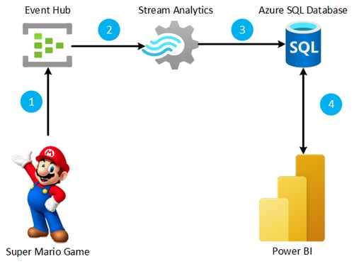
- The Super Mario game sends JSON messages to an Event Hub. The game was modified so that every in-game event (for example, Mario collecting a coin, jumping on a bad guy or falling down a hole), sends a new message to the Event Hub. The game also sends a summary message with information like the final score, lives remaining and total time to the Event Hub.
- A stream analytics job is essential as it enables the game to read messages that arrive on the Event Hub. We achieve this using SQL to process and analyse the data contained in the JSON and send the data to the appropriate destination. In this scenario, the goal was an Azure SQL Database. The different JSON messages from the Event Hub are processed, and extra data points are calculated before being sent to tables in the database.
- Whilst I could have streamed data directly from Stream Analytics to Power BI, this limits the features and visualisation. Streamed datasets, however, enabled us to optimise the use of these features. Furthermore, through extensive research, we have found that using an Azure SQL Database and accessing the data via DirectQuery allows for a more exciting Power BI report, adding to the effect of the game.
- Power BI reads data from the Azure SQL Database and presents a real-time commentary of the gameplay, a leader board and game statistics.
Building the Report
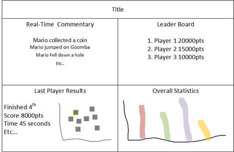
When creating the Power BI report, we had a series of decisions to make. We started by deciding what information needed to be displayed and where to locate it on the report to kick it off. The report would show fast-moving, player-specific information like the live commentary in the top left and slower-moving, more generic statistics displayed towards the bottom right. A draft of the report layout is shown in the image below:
Next, I was able to build each quarter of the report. First up was the live commentary section. I created a table and applied a filter to show the five most recent events. One feature the team wanted was for the visual to update in real-time. With this in mind, I enabled Automatic Page Refresh to refresh every second to provide the most up-to-date information to our players.
Although this worked to some degree, it became clear that table visuals and automatic page refresh were incompatible. Each time the table refreshed, it flashed, creating a distracting strobing effect. With this in mind, I quickly returned to the drawing board and used multi-value cards to make the commentary visual.
I built the leader board and last player result sections using a card visual from the Power BI marketplace and a scatter chart. The statistics section of the report presented the challenge that nobody would be interacting with the report. Slicers, drill-throughs and buttons were not options to switch between visuals or views of the data.
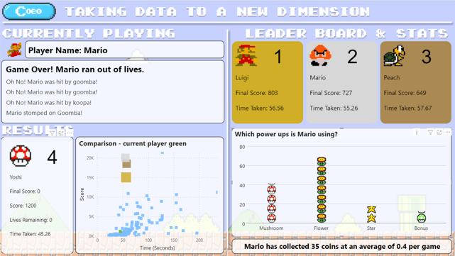
Ideally, I wanted to show these infographics side by side as in the image below:
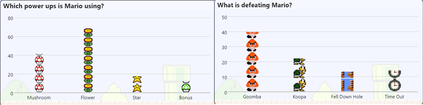
The image on the left shows the power-ups that game players are collecting. Conversely, the image on the right shows how they are losing lives.
There wasn’t space on the report to display both charts, and without user interaction, the game required a change to the infographic display. To rotate between the different infographics, I used the following DAX pattern for the measures, chart titles and anything that needed to be conditionally formatted:
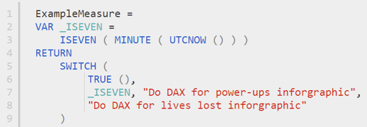
The DAX was effective as it checks if the minute number of the current time returns true if the number is even and false if it is odd. The visualisation uses the DAX related to power-ups when the minute check is accurate and when the minute check is incorrect, the lives lost DAX is executed. Using the technique described combined with automatic page refresh, the statistics section of the report shows a different chart each minute.
The final report ended up looking like the image below:
The Real-World Applications for Businesses
As mentioned at the beginning of my blog, the real stars of this show were the tools used to create the game - Azure services and Power BI. This software enabled us to bring to life the solutions that we had envisioned with the added feature of gameplay. The data is then collected and analysed in real-time whilst displaying the results in Power BI. Through Power BI, we could also produce fast-paced information pop-ups - boosting the player experience. Despite the quality to which they were able to enhance our arcade Super Mario program, Azure Stream Analytics and Power BI have a function away from the gaming industry, and companies in many sectors use them.
Some examples are:
- Retailers manage stock levels and potentially predict future demand.
- To engage with customers in real-time by acting upon their website clicks and shopping patterns.
- Manufacturing companies monitor the health of components so they can be maintained or replaced before they fail.
- Ski resorts use streaming data to monitor snow producers and weather conditions to maintain snow levels on their slopes.
Hopefully, if you attended SQLBits, you enjoyed playing the game. If you have questions, please get in touch in the comments section below or at info@coeo.com. The team and I would love to continue engaging with you despite the end of the event! Both Power BI and Azure services have many real-world applications, and their capabilities extend well past entertainment. So if you're interested in learning more about how Power BI and Azure services can benefit your organisation, please don't hesitate to reach out to us. We would be happy to book a meeting and show you some of the fantastic options available.