
Data quality is an increasingly important part of generating successful and meaningful insights for data-driven businesses. At a basic level, missing data can lead to an incomplete picture of the business situation, leading to poor decisions and stakeholders asking "what did we miss?".
This blog aims to highlight a few of the options available to us in Azure Databricks to profile the data and understand any data cleansing or feature engineering tasks required before we dive in and produce the consumable reports and cutting-edge forecasting which deliver the ultimate business/user value.
Motivation
The purpose of investigating the quality of the data is to understand what we are pulling through and ensure it is formatted and organised appropriately, allowing us to make better decisions. There are a few things we typically look at during this stage, outlined below:
Data quality
- Missing data
- Duplicate data
- Data types (this can often come in different shapes and be written in clashing formats, especially dates)
- Inconsistent formatting
Shape of data
- Row count
- Uniqueness
- Distribution of values (are we skewed to 90% of records having the same value, does it follow a uniform distribution?)
- Why is this data relevant to stakeholders?
- This is probably captured in the requirements gathering stage when the data project kicks off but is an excellent refresher to understand if missing data being pulled back from the source impacts the stakeholder in any way.
- What are the feature engineering requirements?
- The data we gathered may not capture the complete pictures we are trying to paint and some adjustments need to be made. This could be aggregations applied over the wrong timespan, normalisation to prevent features from having dominant weights in ML computations, or categorical encoding to include categorical data in classification tasks.
- The aim is interpretability and data profiling is the perfect place to discover just how "user-friendly" our columns are.
Notebook data profile
The easiest way to get started is to return your dataset as a DataFrame in a notebook of your choice (Python/Pandas/PySpark, Scala, SQL, r). I've imported a CSV of Simpsons Episode data from Kaggle.
We can see the tabular results using the display function, but there is one additional option, to select the data profile.
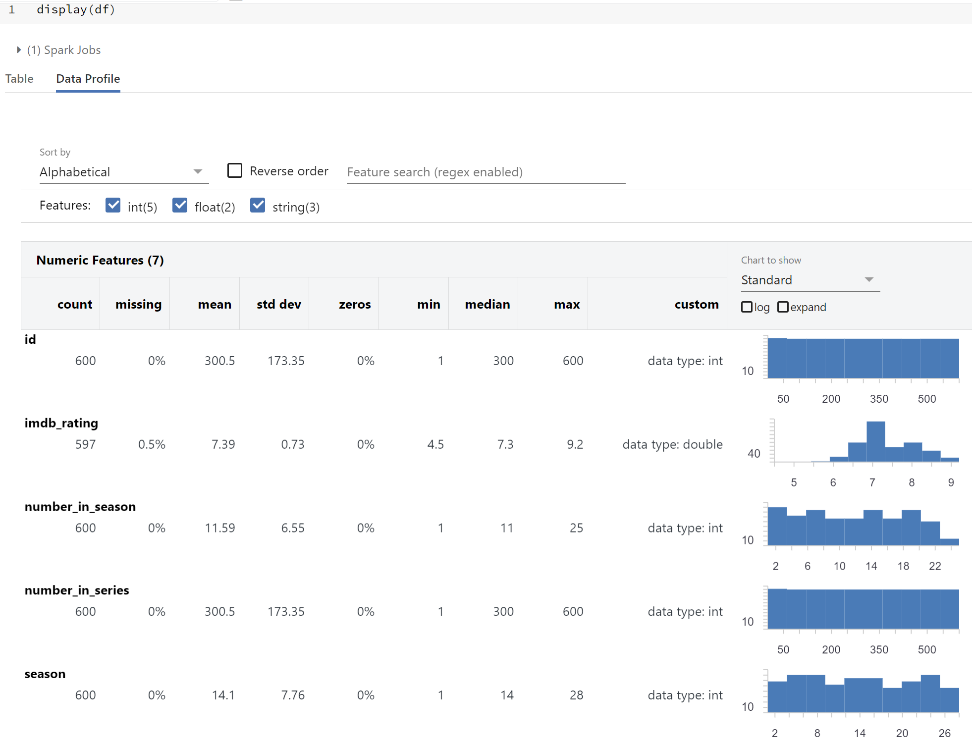 Here we get the descriptions you would see in functions like df.describe() along with a histogram showing the distribution of values. Alongside quickly picking up on missing values, we're able to quickly spot quirks of the data such as unbalanced distributions or unexpected max values, possibly the result of user error.
AutoML
AutoML is a tool that allows users to quickly generate machine learning models for a specified dataset at the click of a button. By specifying a column you wish to predict or classify, AutoML prepares the dataset for training and runs various trials and their evaluation metrics for you to determine appropriate machine learning models to investigate further with reproducible notebooks and artefacts for comparison.
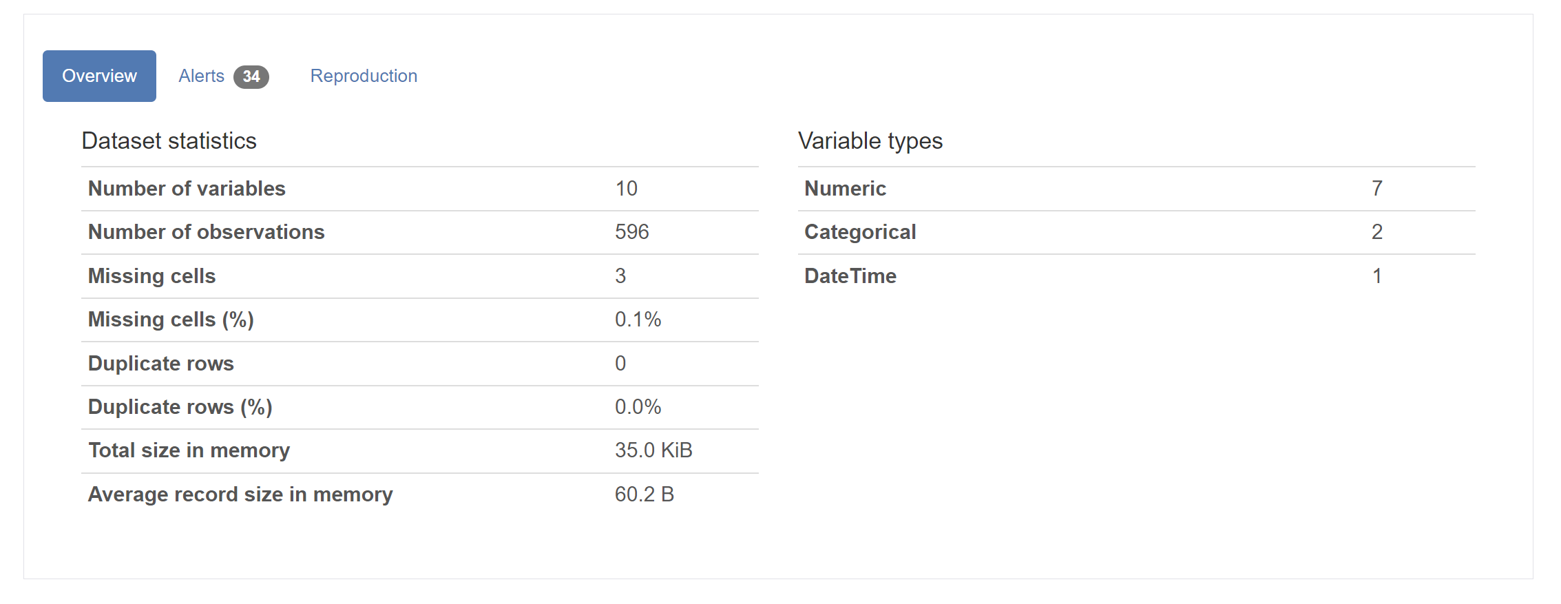
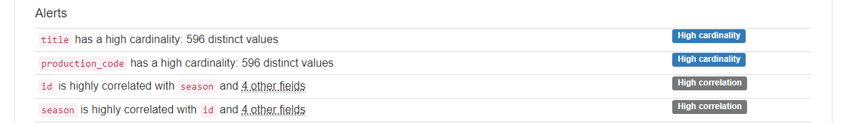
AutoML isn't just great for jumpstarting your Machine Learning modelling process though. As part of gaining some understanding of the data, it runs the pandas_profiling module to produce a data exploration notebook, which you can open and see similar graphical explorations of your dataset seen in the Databricks data profiling tool. The data exploration notebook contains the following breakdown of the data:
- Overview, alerts and reproduction
- The overview provides high-level summaries of the dataset looking at counts of variables, observations, missing data details and duplicates.
- Alerts inform us of the columns where we may have incomplete or redundant data.
- Reproduction gives info on config options along with how long the profile took to generate.
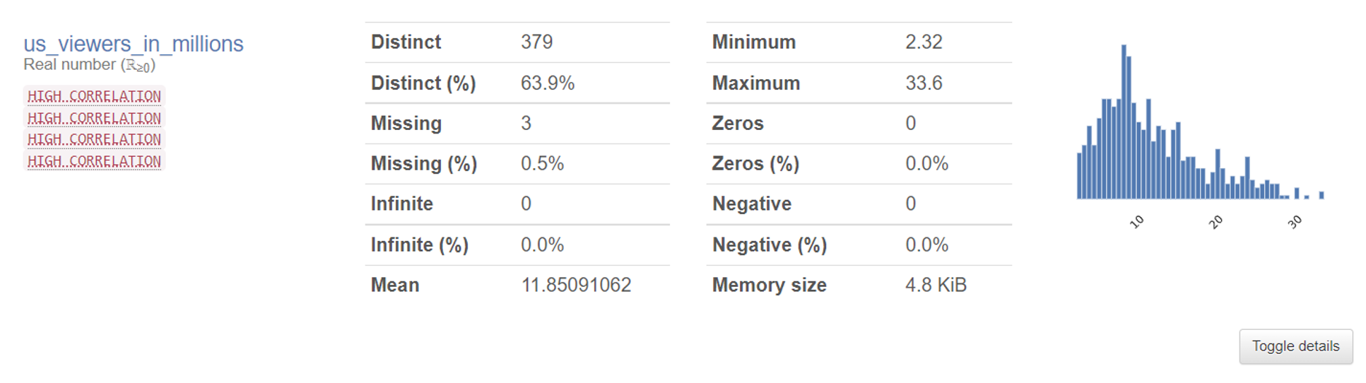
- Variables
-
- Here we get the visual information on the spread of data alongside any warnings flagged up in the alerts. This is a bit more verbose than the information returned in the default data profile.
- Here we get the visual information on the spread of data alongside any warnings flagged up in the alerts. This is a bit more verbose than the information returned in the default data profile.
- Interactions
- Scatter plot of numerical data columns
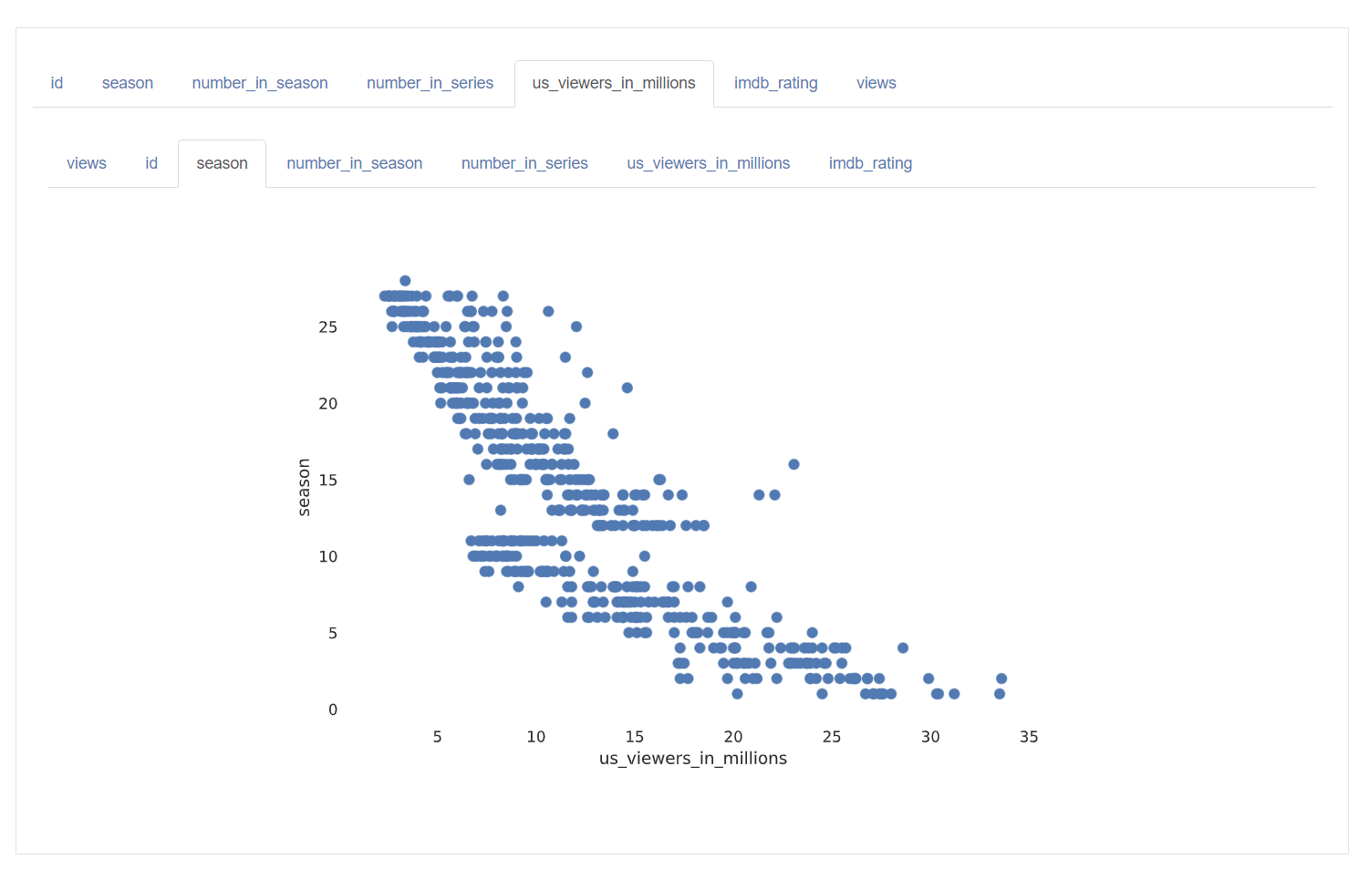
- Scatter plot of numerical data columns
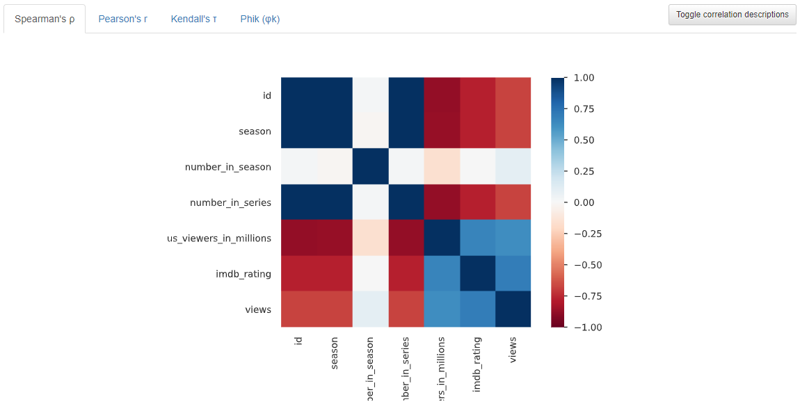
- Correlations
- Shows how tightly correlated numerical points are
- Different correlation coefficients available
-
Missing values
- There are a few views to understand your missing data a bit better
-
Data sample
- For those who enjoy a tabular view of the data
To use this great tool, you must save your DataFrame as a Hive table, which is as straight-forward as the following command:
Instructions on running an AutoML experiment to generate this Profile notebook can be found here.
Custom queries and visualisations
We can naturally get all of the above information ourselves by querying the data directly in whichever is our preferred language in Databricks, along with further insights we may have an interest in.
With domain knowledge and understanding of the data, we know the questions stakeholders wish to discover the answers to. Targeted analysis at this stage is important in scoping whether you have sufficient information to answer their questions. If not, is feature engineering required or is additional web-scraping/data collection needed to fill these blanks? This is something a generic profiling tool can't do, but they do allow us to take some of the legwork out so we can focus on the questions specific to our business needs.
Databricks' easy-to-use Data Visualisations based on our queries, paired with using a variety of languages, provides the ability to perform data exploration before the need to build a clean data model.
In this example, we might want to investigate the importance of a character in the episode title:
Such as the Average rating of episodes over time
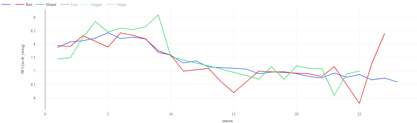
Or the consistency of episode ratings for the main characters:
-png.png)
Another line of investigation might be to look at the recurring words in the titles, and if this is a predictor of success or viewership.
Word clouds are a selectable visualisation in Databricks (no need to download a python module!)
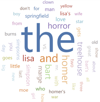
This can in turn give some quick insights into the success of these commonly used words (once we have filtered out the less informative filler words such as "the" and "and").
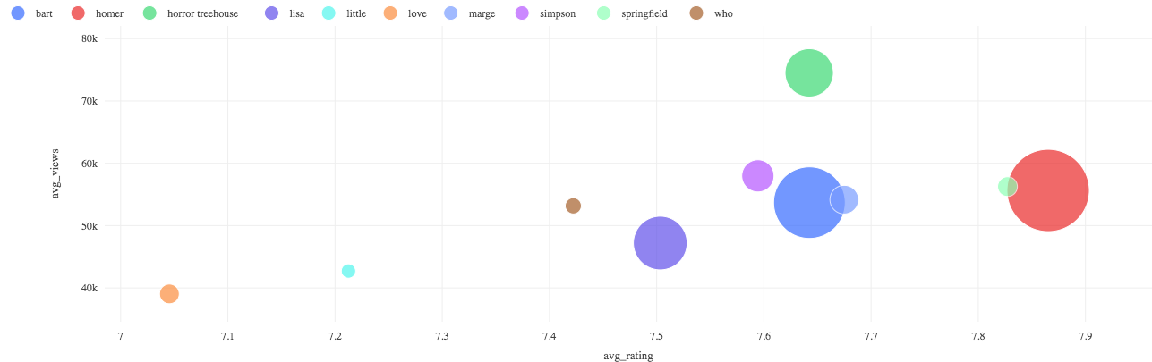
For example, we see consistency in the success of the Treehouse of Horrors Halloween specials in each season - are there any other patterns worth reviewing?
-png-1.png)
This might provide an incentive to pull transcript data from the episodes for analysis of dialogue, or word counts per character for themes or character pairings that are successful.
The notebook with the source code to produce these visuals can be found in my GitHub repo linked here.
Comparison
|
Method |
Advantages |
Limitations |
|
Data Profile |
|
|
|
AutoML |
|
|
|
Custom Queries |
|
|
Closing Thoughts
Identifying data quality issues early in your data lifecycle is beneficial to efficiently move data from raw to consumable format. The visual inspection of your data helps to quickly identify gaps that may be required to build the complete picture which is required for analysis and reporting further down the line.
That being said, this process can be beneficial to multiple teams in your data department. Data Engineers can review the quality of the raw data being ingested and Data Scientists can start to understand dimensionality reduction opportunities with the transformed level.