
In this post we’ll be walking through a quick and easy way to standardise and simplify your Power BI reports using backgrounds. Here’s an example of what we will be building today:

What you will need:
- Power BI desktop
- PowerPoint
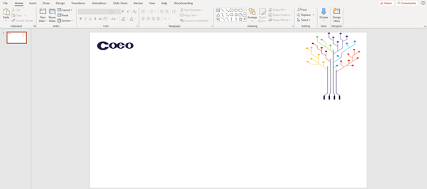
First create yourself a new blank PowerPoint slide and set a background. In this example we have used our standard Coeo PowerPoint template:
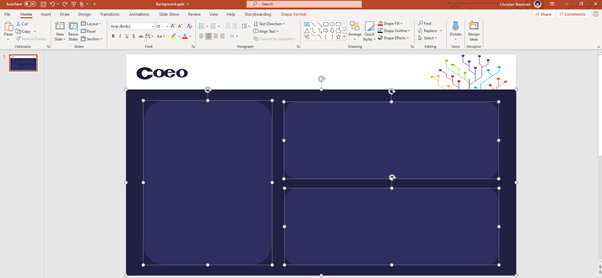
Then we want to add some shapes to house our visualisations like so:
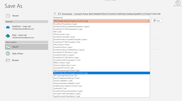
Once you’re happy with the layout, we want to go to “File” > “Save As” and select the .png file type and press save:
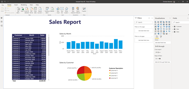
We then take a Power BI report we created earlier:
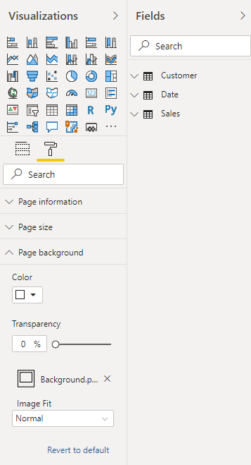
We then want to add our .png background we created earlier. Go ahead and select the format painter for the whole page, then add the previously saved .png file as the background as shown below and ensure transparency is set to 0%:
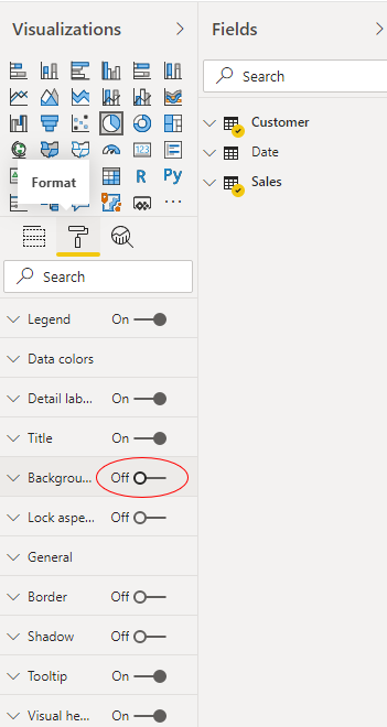
Now that we have set the background, you will want to turn the background for each of the charts to “Off”. You may also need to adjust the labels for some of your visualisations X and Y axis depending on your colour palette:
You will want to do this for each of your charts. Here’s a screenshot of the finished product:

We hope you found this useful and a neat trick to help standardise your Power BI reports.