
Introduction to the problem
We recently worked with a client who wanted to report on the number of sales per region with the ability to drill down to a specific county and town. Out of this came a requirement for a Power BI report with stacked bar charts with concatenated labels.
The data consisted of a hierarchy called County Hierarchy and a SalesID column, which we needed to count to get the total number of sales for a specific area.
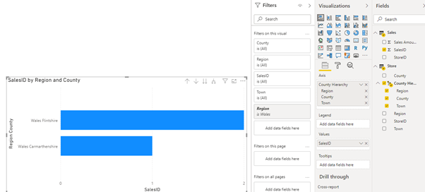
We needed concatenated labels to visualise the correct region when the user drilled down using the County Hierarchy. Concatenating labels will allow you to see the value preceding the current hierarchical level. In this example we will drill down into the Wales Region where you will see "Wales Flintshire" rather than "Flintshire".
Although this may seem simple to anyone who’s used Excel for reporting, it soon became apparent this wasn’t the case in Power BI.
Finding a solution
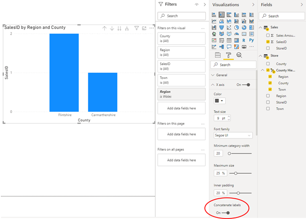
We found that when creating a Stacked Bar Chart visualisation and using the County Hierarchy on the Y axis and Sales Count on the value, there was no choice to concatenate labels on the Y axis formatting options (shown below).

We know from experience that by changing the chart to a Stacked Column Chart, there is a concatenate option available on the X axis (shown below).
We observed that by setting concatenate labels to “Off” and changing the visual back to a Stacked Bar Chart, the Y axis labels concatenated correctly when we drilled down using the County Hierarchy:
The client responded and said they weren’t seeing that same behaviour in Power BI Desktop – they couldn’t get Power BI to prevent concatenated labels on the X and Y axis. To our surprise they were right! After comparing how the client had set up their report with how we had set up ours, we were able to identify the cause of the difference.
If we run through the same steps as before, creating a separate visual, but this time select SalesID first and the county hierarchy second. You will notice that both chart types always concatenate the labels no matter which option you choose. We believe this to be a bug in Power BI.
Summary
Although there are other ways around this problem such as displaying the region that is selected elsewhere on the page, it is nice to know that the option is there should you want or need it. It is also worth pointing out that this trick works the same for Clustered Column and Bar Charts.
Notes
Please note the above is true and accurate for Power BI version: 2.81.5831.761 64-bit (May 2020).